Bootstrap 5 Alerts
Bootstrap 5 provides an easy way to create predefined alert messages:
Bootstrap Alerts are used to provide an easy way to create predefined alert messages. Alert adds a style to your messages to make it more appealing to the users.
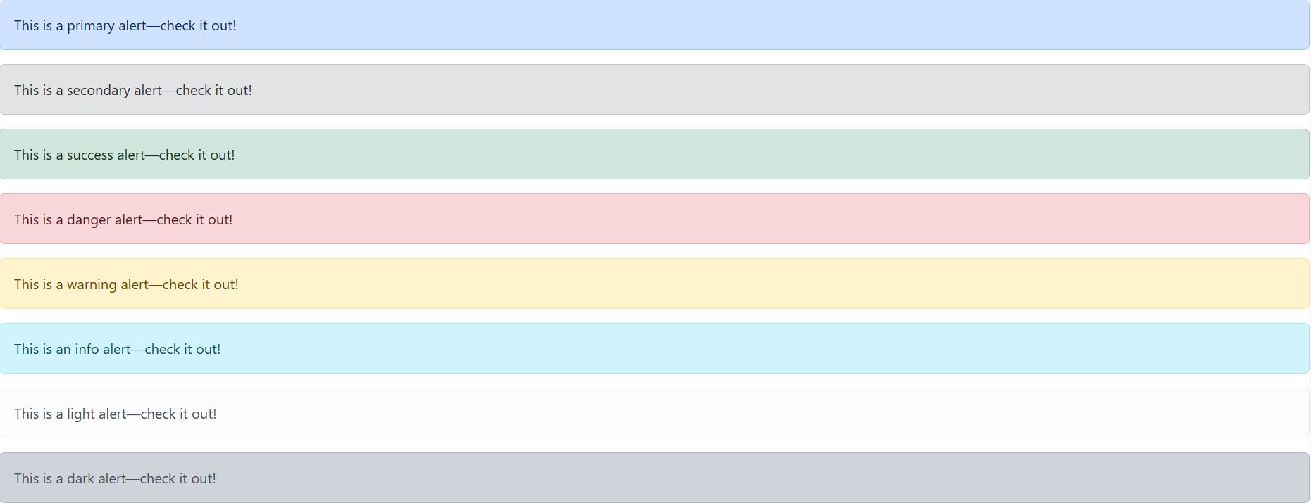
Alerts are created with the .alert class, followed by one of the contextual classes .alert-success, .alert-info, .alert-warning, .alert-danger, .alert-primary, .alert-secondary, .alert-light or .alert-dark:
Example
<div class="alert alert-primary" role="alert"> <div> This is a primary alert—check it out!,</div> <div class="alert alert-secondary" role="alert"> This is a secondary alert—check it out! </div> <div class="alert alert-success" role="alert"> This is a success alert—check it out! </div> <div class="alert alert-danger" role="alert"> This is a danger alert—check it out! </div> <div class="alert alert-warning" role="alert"> This is a warning alert—check it out! </div> <div class="alert alert-info" role="alert"> This is an info alert—check it out!You can click on above box to edit the code and run again.
</div> <div class="alert alert-light" role="alert"> This is a light alert—check it out! </div> <div class="alert alert-dark" role="alert"> This is a dark alert—check it out! </div>
Output

In this example:
