CSS Media Queries(Examples)
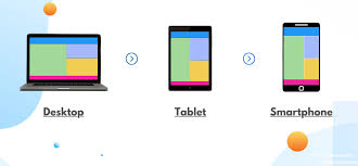
Media queries are commonly used to provide a customized style sheet for various devices. For instance, we can adjust the background color based on the device:
Example
<!DOCTYPE html>
<html>
<head>
<style>
body {
  background-color: tan;
  color: black;
}

/* On screens that are 992px wide or less, the background color is blue */
@media screen and (max-width: 992px) {
  body {
    background-color: blue;
    color: white;
  }
}

/* On screens that are 600px wide or less, the background color is olive */
@media screen and (max-width: 600px) {
  body {
    background-color: olive;
    color: white;
  }
}
</style>
</head>
<body>

<h1>Resize the browser window to see the effect!
<p>By default, the background color of the document is "tan". If the screen size is 992px or less, the color will change to "blue". If it is 600px or less, it will change to "olive".

</body>
</html>
You can click on above box to edit the code and run again.